Hello, I have been paying you since you allowed me to ahah the yearly subscription so in the long time I can contribute more!
Which means I’ve been watching this app development every day, and always shared my opinion…
And my recent opinion is that recently the app has been looking somewhat outdated and boring looking, and not even as practical as it could bem. It improved quite a bit with bottom navigation but I would like to see some things, I’ll list them:
1- card view in shows and movies view
2- more separation between shows and movies in current view, with bigger images
3- more robust statistics with info displayed in cards like shows in first card, movies in second and total in third, and a final evolution graphic would also be awesome
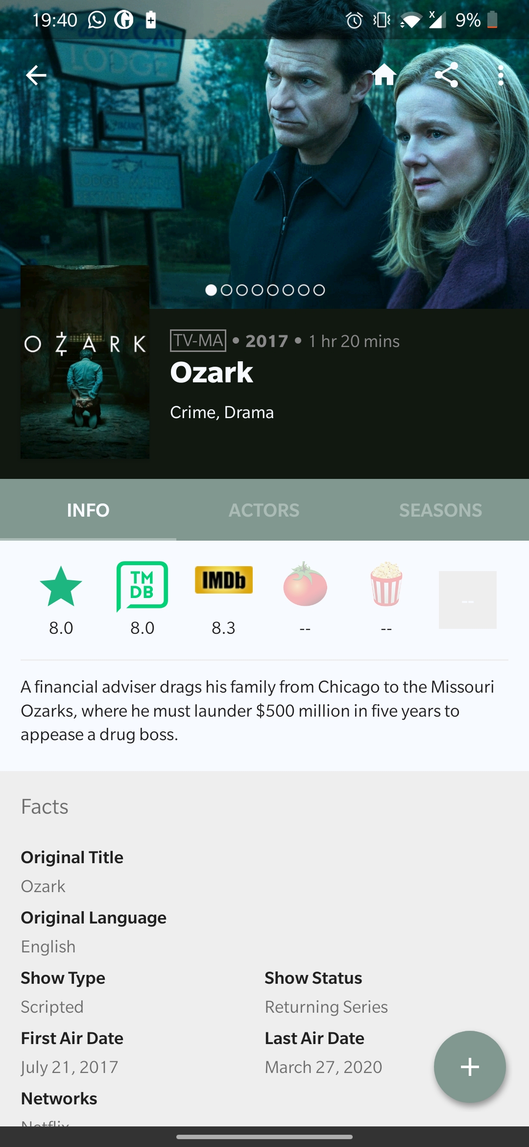
4- revamped tv show info page with bigger side to side image, better layed out info and more appealing look
5- better simpler discover pane… oh and you could join the search of your shows with the search of discover, and simply show added shows first
I can only leave a single image as I’m a new user, but I have many implementations I find really good looking and really well though and I can send them to you!
if you need any help Design them or something let me know! I just want to help create a better app, I expect nothing in return
separation between shows and movies in current view are fine, and why do you want bigger images, they are about right size too.
Image sizes on both mobile and on a tablet are fine, no need for them to be larger than they already are. In fact any bigger and it will end up with only 1 show being shown on each page instead of (for example on a mobile) I get 4 per page.
I understand with what you say… but with all these 20:9 screens, the Design should accompany the time… I think it’s proportions are good looking for a 16:9 phone…
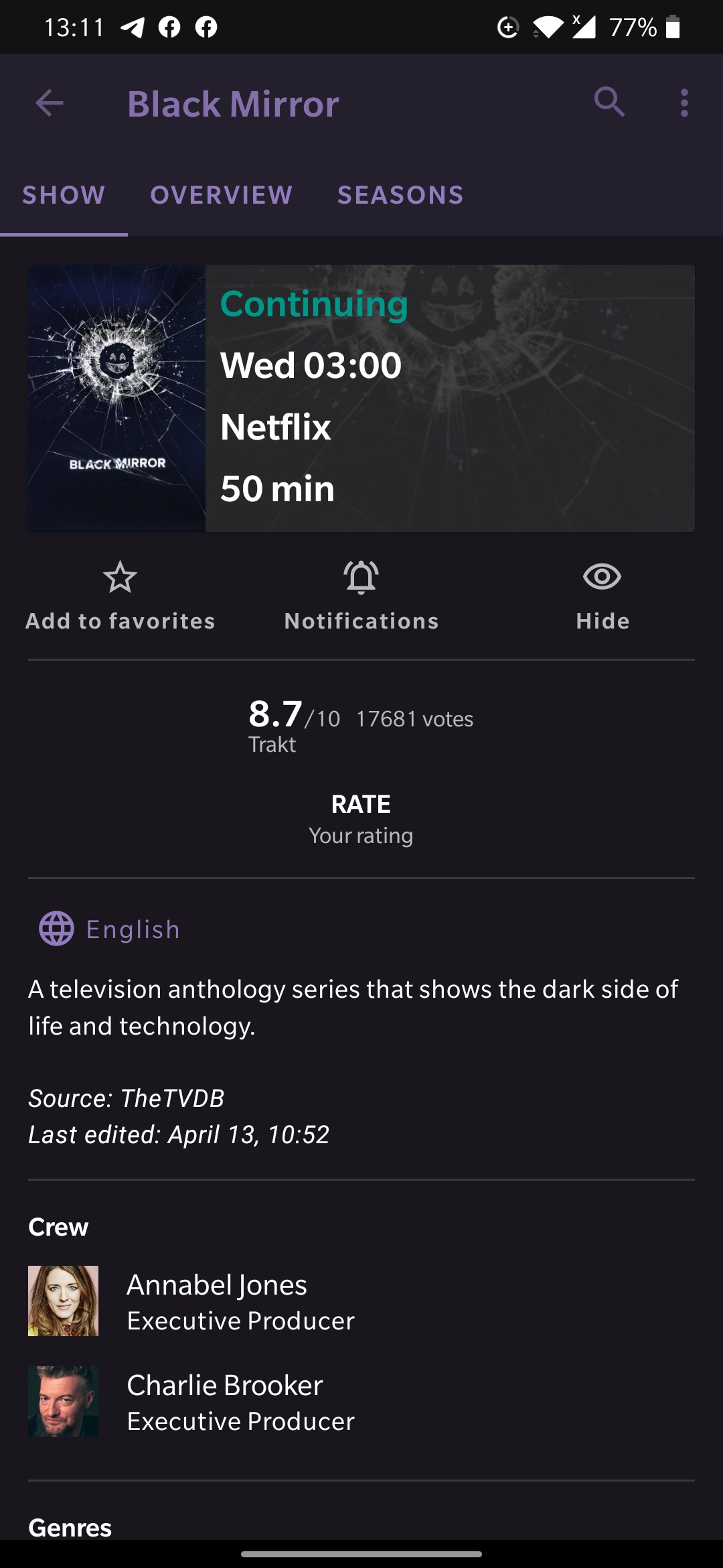
But that’s not my biggest “complaint”… if I had to pick one thing to overall it would be the tv-show “show” and “overview” panel’s… they look dated, confusing and don’t present as much relevant info as they could the image I attached in the original post shows a really good tv-show page…
Just my opinion though
wow, just a thank you? I left similar topics and not an answer either. We give suggestions based on updated apps. I migrated from a good guy who doesn’t have notes for movies. I liked the SeriesGuide because it had different features, I even paid for the subscription. But I noticed that my old app has grown and SeriesGuide hasn’t. It might be a good idea to pay more attention to subscribers than short, straightforward responses as I’ve seen on various topics.
I’m a single person responding to dozens of people every day. And next to that I have to maintain the app, its servers, paper work, etc… I’m also busy with the TMDB migration. So cut me some slack, please.